Next: ROC Analysis Up: Analysis Previous: Trajectory Summary Contents
Now that we have an idea of what our clusters look like from the Trajectory Summary Plots, we will compare the 'Cho Classification', 'DiagEM w/ K=5', and 'K-means w/ K=5'. This will be done using a Confusion Matrix Plot.
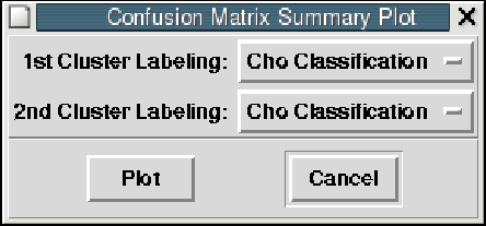
For starters, let's compare the 'Cho Classification'1 to itself. Select 'Build Confusion Matrix' from the 'Analysis' menu. Then select 'Cho Classification' for the '1st Clustering Labeling' and '2nd Clustering Labeling' as shown in the figure below. Click 'Plot' when you are ready to move on.
You should get a Confusion Matrix plot similar to the following figure. Notice that there are two 'Trajectory Summary' sections being displayed with white backgrounds (top row and last column). Each one of these sections is a clustering, in this case 'Cho Classification' versus itself. If you look at the five clusters in the top row, you'll notice that I have super-imposed green and red bars in the figure below. The green bars are highlighting the number of genes2 in a given cluster. The red bars are highlighting the name of the clustering.
What is this matrix telling us? It's showing us the number of members of column Y that are showing up in row X. For example, if we look at column 2 (M Phase Cluster) and compare it to row 2 (S Phase Cluster), we see that the 'M Phase Cluster' has no members that are shared with the 'S Phase Cluster' (see figure below). Later when we compare our clustering results to Cho's, things won't be as clear as this. If you look at row 1 (Late G1) vs column 5 (Late G1) you'll see that 134 out of 134 members are shared between the two clusters (because they are the same cluster).
Now let's move onto a more interesting comparison. Let's compare the 'Cho Classification' to our clustering of 'DiagEM w/ K=5'3. Select 'Build Confusion Matrix' from the 'Analysis' menu. Then select 'Cho Classification' for the '1st Clustering Labeling' and 'DiamEM...k=5...' for the '2nd Clustering Labeling' as shown in the figure below. Click 'Plot' when you are ready to move on.
As you can see from the figure below, you get a much more interesting plot. We have 'DiagEM' on the X axis and 'Cho Classification' on the Y axis. Note that DiagEM gave the clusters numeric labelings as it had no way of knowing any biologically related information for naming purposes. It is the job of the user to try to figure the meaning of those cluster labels.
I'll start by describing the coloring scheme. The colors range from red to blue, where pure red is 0% of the members for a given row and column are shared by the two clusters. Pure blue would mean that 100% of the members are shared between the two clusters. If we look at column 1 (DiagEM Cluster #4) and compare it to row 2 (Cho's S Phase Cluster) we see that 2 out of 13 (15.38%) members are shared between the two clusters, which is why it has an orange color. 4
If you look at column 5 (DiagEM Cluster #2) vs row 1 (Late G1) on the figure on the previous page, you will notice that 117 members out of 151 are shared between the two clusters.
Brandon King 2005-05-27
![\includegraphics[width=\textwidth]{tkImages/compClustTk-Analysis-ConfusionMatrixTab-ChoClass-vs-ChoClass-HighlightedLabels}](img19.png)
![\includegraphics[width=\textwidth]{tkImages/compClustTk-Analysis-ConfusionMatrixTab-ChoClass-vs-ChoClass-Row2-Col2}](img20.png)
![\includegraphics[width=\textwidth]{tkImages/compClustTk-Analysis-ConfusionMatrix-Diaglog-ChoClass-vs-DiagEM}](img21.png)
![\includegraphics[width=\textwidth]{tkImages/compClustTk-Analysis-ConfusionMatrixTab-ChoClass-vs-DiagEM}](img22.png)